
Project · UI Design
DMRZ
AI Prototyping
Claude Design
Overview
01Project Brief
DMRZ is a German cloud platform that helps healthcare providers, from care services to therapists, handle their billing with health insurers and organize their daily work. In this case study, I redesigned the login, registration, and confirmation flow on desktop, from usability testing to low fidelity, high fidelity, and an interactive AI prototype.
Problem Statement
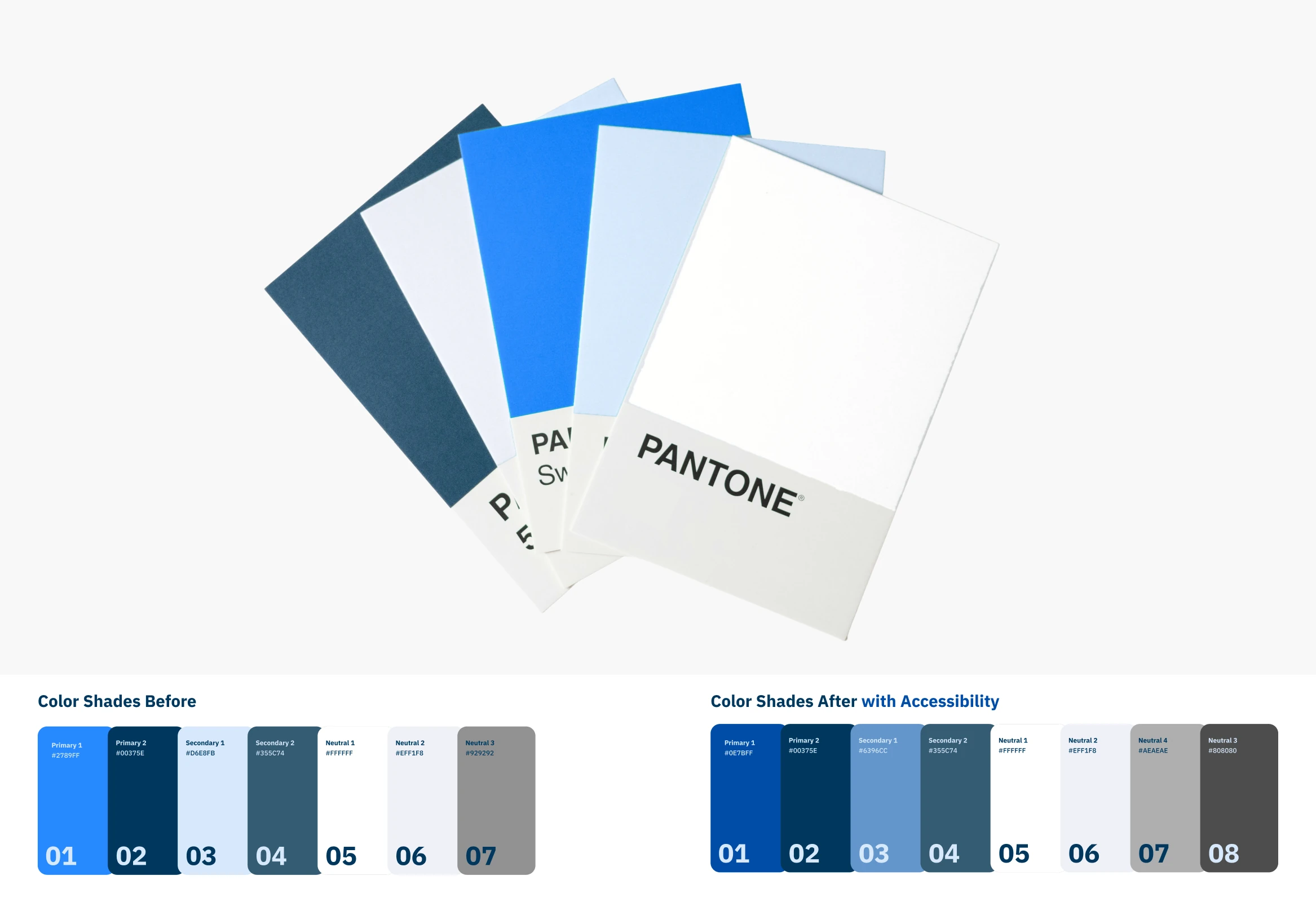
The existing interface has grown over time. Usability testing and a closer analysis of the website showed that the colors used are not accessible enough, and that the entry flow leaves room for a clearer, more intuitive experience for new users.
My Task
Not a rebranding, but a redesign. My goal was to pick up the existing identity of DMRZ and develop it further, keeping the platform recognizable while making the interface simpler, more accessible, and easier to understand, so users find their way easily.
Process
My process followed the Double Diamond principle, with a focus on Discover and Develop, since I was reworking an existing interface rather than building something completely new.
Discover · Testing & Analysis
02Usability Testing
Before starting to design, I walked through the entire registration flow the way a new user would. The test surfaced real friction: the main call to action gave no feedback when clicked, fields accepted invalid input without validation, and the password toggle did not work. The form also offered only two gender options, so not everyone felt included.
Interface Analysis
Analyzing the website in detail, I found that the colors in use fall short of accessibility standards. I also examined the typography to understand the existing design language, building a foundation for a redesign that respects the identity instead of replacing it. A Lighthouse audit, Google’s tool for measuring website quality, confirmed this: the existing login scored 77 out of 100 for accessibility.
Visual Direction
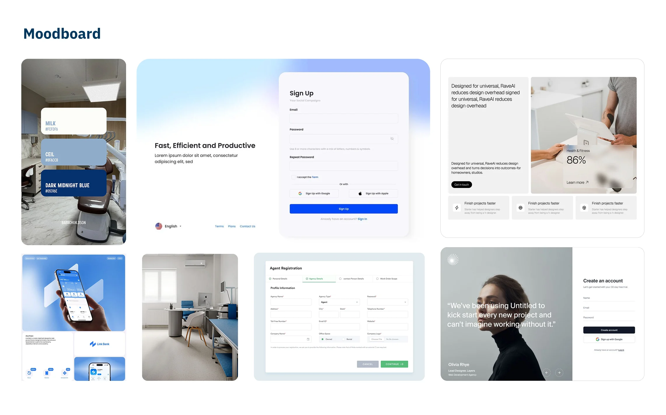
Based on these findings, I created a moodboard and gathered visual inspiration for how a calm, welcoming interface for login, registration, and confirmation could look, one that guides users naturally through each step.
Develop · Low Fidelity
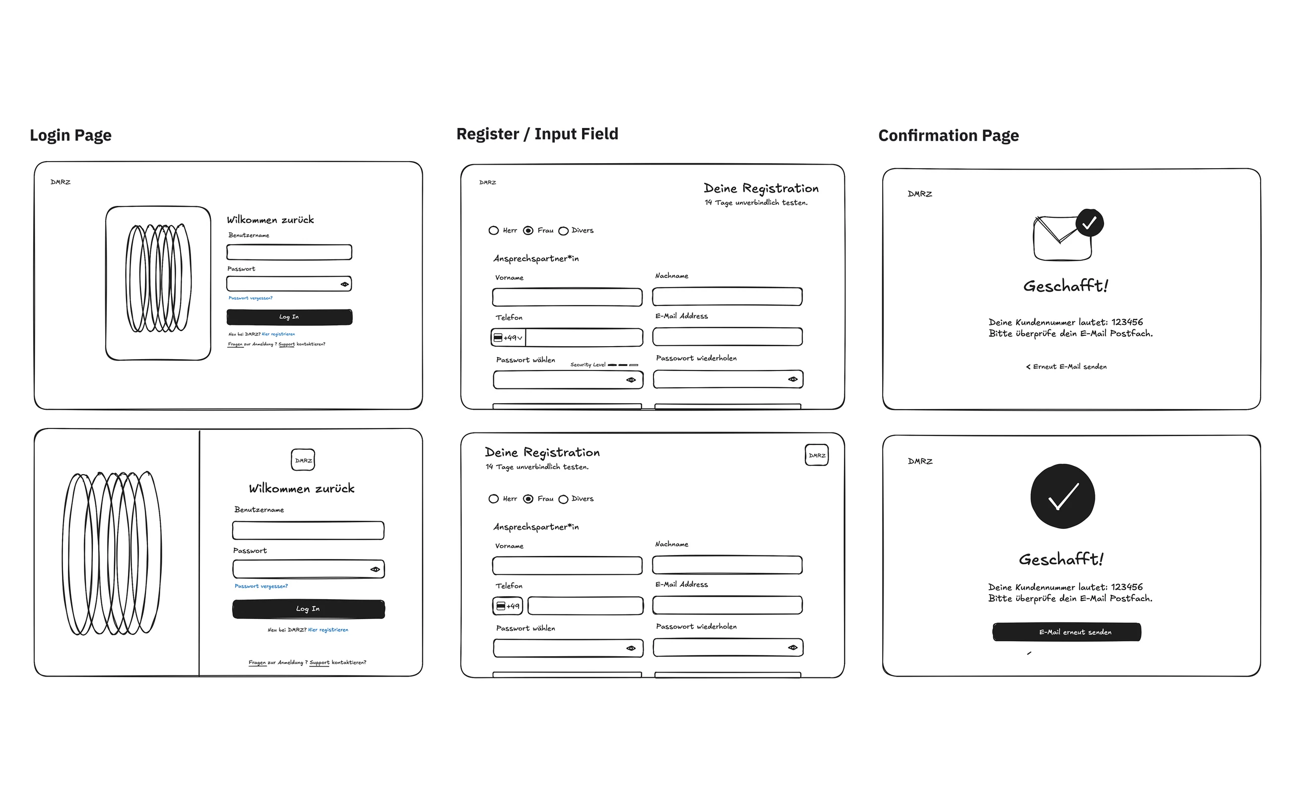
03Concentrating on login, registration, and confirmation, I developed the first low fidelity sketches with Excalidraw, exploring two layout versions for each screen before committing to a direction.
UI Patterns & Design System
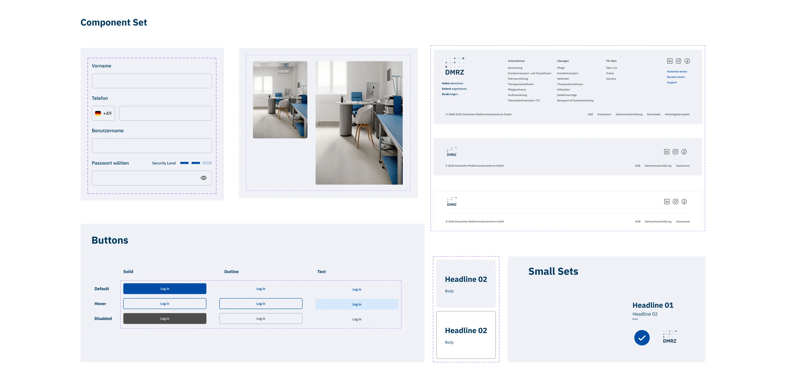
04From the sketches, I built a complete design system in Figma with all the components the flow needs, grounded in the refined, accessible color shades and the typography of the existing brand.

High Fidelity · AI Prototype
05Building on the design system, I created three different high fidelity directions with different colors and layouts. The final direction keeps the DMRZ blue as an anchor and gives the forms space to breathe.
Prototyping with Claude
To test whether the design actually works, I built an interactive prototype with AI. I used Claude because it is the tool I am most familiar with, connecting my design system and project file and developing the prototype through targeted prompts, to feel how the design behaves clickable and interactive.
The Flow
In the prototype you can click through three central screens. You start on the login page, choose to register, fill in the form, and complete it with the free trial. The confirmation page then shows the successful end of the registration.

What I learned
06Summary
This project showed me how much clarity emerges when you truly understand an existing system before changing it. Analyzing the identity, the colors, and the typography first made every design decision afterwards more grounded.
Especially valuable was experiencing how AI can support the later process, reaching an interactive prototype faster and more simply, without losing my own design decisions along the way.